
I went to a really exciting workshop last week (how often can you say that and mean it!) by David McCandless of Information is Beautiful-fame.
Data has become a crucial part of a communicator’s role, both for visualising external comms stories and for gaining internal buy-in. I encourage any marketers or PRs to attend the next session so I won’t give away too many spoilers, but…
Throughout the session, David explained the core principles of creating interesting data visualisations. The crux of his process and methodology is based on coming up with good concepts and ideas in the first place: “Concept, data, story, design, style - all are precision arts. In visualisation, they're stacked one on top of the other. If one sags or slips, the entire edifice can collapse.”
Concepts with purpose
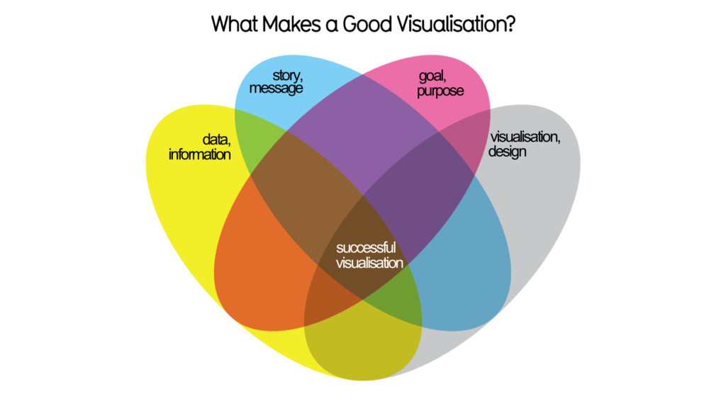
This is essentially (and reassuringly) the same advice that we give to clients when generating campaign ideas - that the most effective concepts have a clear goal and strategy behind them. To come up with good data viz, David says you need:
His process:
Lacking inspiration?
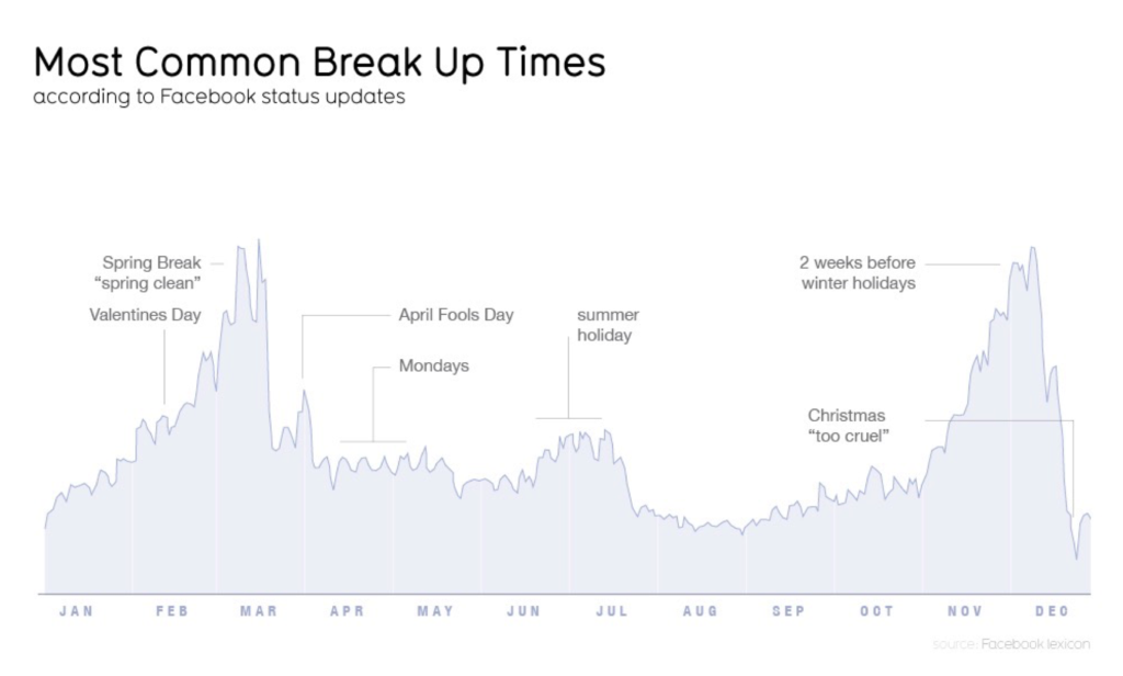
In both data viz and campaign planning, the concept itself could be based on a question, a problem or a very broad theme that appeals to your audience. If you’re lacking inspiration for campaign ideas, we often suggest thinking of a topic that creates fear, uncertainty and doubt - it’s a sure fire way to grab an audience’s interest. David calls that ‘negative concepting’ in a data viz context - see diagram below.
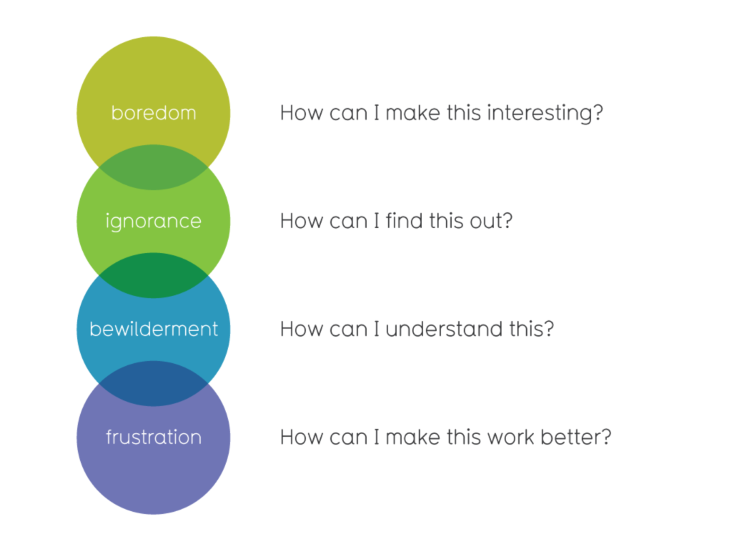
We say that there are three ways to provoke an audience response based on positive opportunities and negative threats:
Many comms professionals won’t think of themselves as data-savvy but the principles of generating a cool dataviz are the same as creating a compelling marketing or PR story.
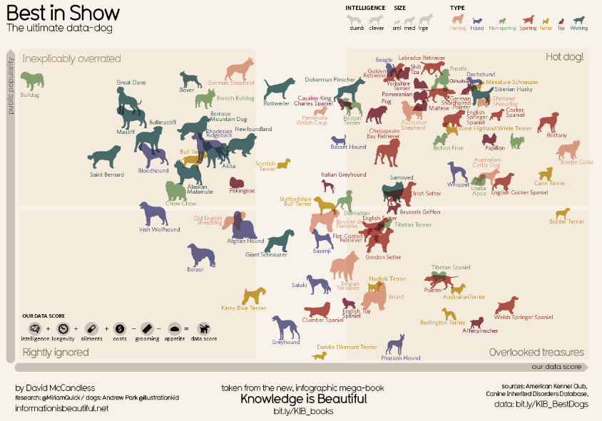
Perhaps it’s not too much of a stretch for us to put that maths GCSE to good use (just me?) and think about displaying our stories as data visualisations to better communicate the message. The Information is Beautiful website provides all the inspiration we need…
Head Office
Moore House
13 Black Lion Street
Brighton
United Kingdom
BN1 1ND
London Office
24/25 The Shard
32 London Bridge Street
London
United Kingdom
SE1 9SG
+44 (0) 1273 716 820
[email protected]
Head Office
Moore House
13 Black Lion Street
Brighton
United Kingdom
BN1 1ND
London Office
24/25 The Shard
32 London Bridge Street
London
United Kingdom
SE1 9SG
© 2005 - 2024 Man Bites Dog